A Snackbar is a lightweight material design method for providing feedback to a user, while optionally providing an action to the user. They are displayed on the screen until a specified interval has passed, the user swipes to dismiss them, or when the user interacts with another part of the screen. Think of it as a modern take on the Android Toast.
This week at Google I/O 2015 the Android Design Support Library was released including a Snackbar implementation. Before now implementing and following the material guidelines for a Snackbar was left to the developer. A few third party libraries were released to make developers lives easier, but now official support for Snackbar has been introduced to make it easier than ever to add a Snackbar to your Android app.
Support for Snackbar pre-lollipop
While the Snackbar concept was introduced with the material design guidelines, the newly released Android Design Support Library works with devices right back to Android 2.1 (API 7). That is over 99% of active Android devices.
Material design specification for Snackbars
Many of the design rules for Snackbars are automatically enforced by the new support library. For example, if you provide lower case text for the action button it will automatically be displayed in upper case. However you still should brush up on the exact guidelines to know the best practices and what you can and can not do with a Snackbar. Take a look at the specification for full details.
A summary of the guidelines are:
- Content: Keep text short
- Icons: Do not add icons
- Core functionality: Do not place core app functionality into a Snackbar
- Multiple Actions: Use a dialog if you have multiple actions
- Input: Snackbar does not block input, use a dialog for this
- FAB: Don’t block the floating action button (FAB)
- Consecutive: Only one can be displayed on the screen at any time
- Single-line height: 48dp
- Multi-line height: 80dp
- Font: Roboto Regular 14sp
- Action button: Roboto Medium 14sp, all-caps text
- Default background fill: #323232 100%
- Width on Tablets: Minimum 288dp, maximum 568dp
Adding a Snackbar to your app
Firstly you will need to add the Android Design Support Library dependency to your gradle build script:
compile 'com.android.support:design:22.2.1'
Next, you need to add a CoordinatorLayout to your xml layout. More details about what new features this new layout class bring are included later in this blog. Here is one that will position itself centered at the bottom of the screen:
<android.support.design.widget.CoordinatorLayout
    android:layout_width="match_parent"
    android:layout_height="match_parent"
    android:layout_alignParentBottom="true"
    android:layout_centerHorizontal="true"
    android:id="@+id/snackbarPosition">
</android.support.design.widget.CoordinatorLayout>
In your AppCompatActivity class you need to configure the Snackbar object using the Builder design pattern. The most useful functions will be to create the Snackbar with make(), optionally set an action that the user can perform using setAction(), and finally to display the Snackbar to the user, show().
Snackbar will only work in Activities that are AppCompatActivity. If your activity extends a standard Activity or ActionBarActivity then you will need to either change your base class or use a third party implementation of a Snackbar.
Here is an example of a Snackbar that displays a message and allows an action to be executed by the user:
import android.support.design.widget.Snackbar;

public class MainActivity extends AppCompatActivity...

final View.OnClickListener clickListener = new View.OnClickListener() {
    public void onClick(View v) {
       ...
    }
};

final View coordinatorLayoutView = findViewById(R.id.snackbarPosition);

Snackbar
    .make(coordinatorLayoutView, R.string.snackbar_text, Snackbar.LENGTH_LONG)
    .setAction(R.string.snackbar_action_undo, clickListener)
    .show();
The result should be a Snackbar displayed on the device as shown in the image below. Note how the Snackbar in this image conforms to the specification. The text is kept short and the action text is all upper case. It is displayed on a tablet, so you will see rounded corners of 2dp and that a minimum width is enforced.
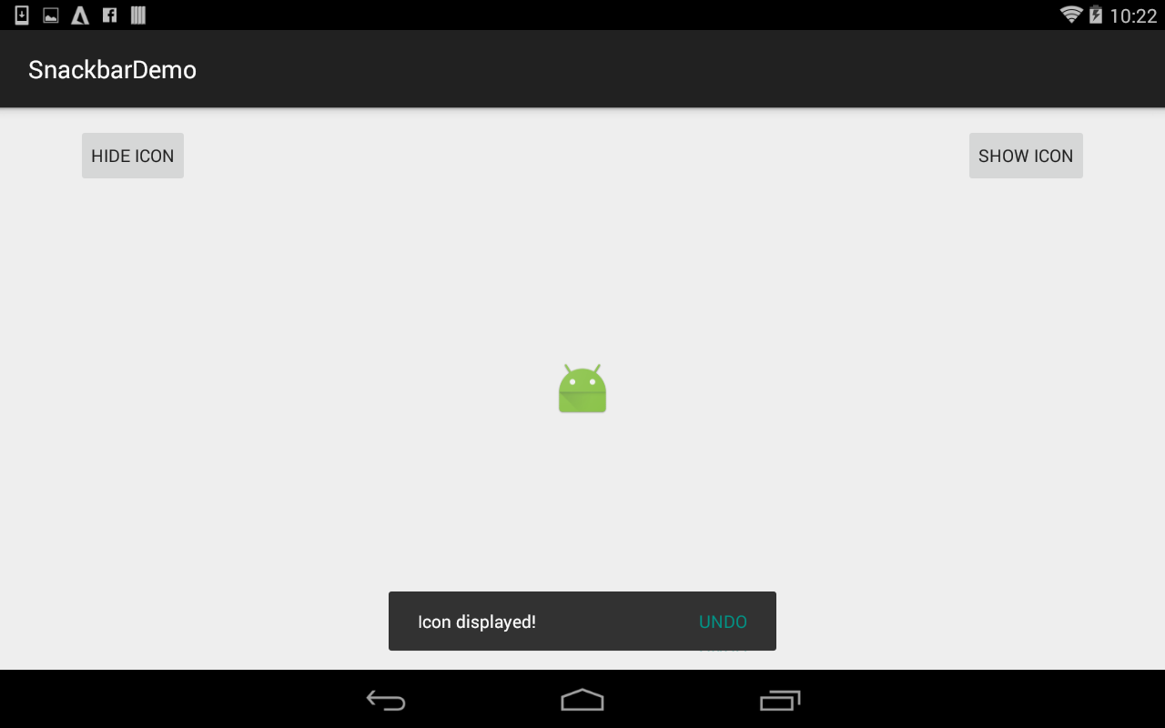
Snackbar displayed on pre-lollipop tablet
Processing the Action button
The Snackbar action button should present an action related to the information being presented to the user. The most common type of actions are UNDO and RETRY.
Remember in the Material Design Snackbar specification that you can only show one action on a Snackbar, and that action must be short text composed entirely of uppercase text, no icons.
In the previous Snackbar example you can see that creating a View.OnClickListener() and adding it with an action is quite simple. The only work left is how you handle a click on the action button. Let’s take a look at an example, it is one of the most common use cases for a Snackbar. You have a list of items that are loaded from a database. With a swipe of the finger the user removes an item from the list and you display a Snackbar to confirm to the user that the item has been deleted and provide a action button to UNDO the delete and restore the item.
There may be a temptation to think that the easiest solution here is to remove the item from the list and wait until the Snackbar has completed being displayed and then do the actual delete from the database. If the user has hit the UNDO action button then add the item back into the list and don’t do the delete from the database.
The Snackbar implementation in Android does not encourage this type of implementation and in fact it doesn’t provide a callback to signal when the Snackbar view is no longer visible. The design pattern that Android wants you to follow for the example I have given is when the item is swiped from the display the item should be removed from the database immediately. You should keep the data needed to re-insert this item in the case that the user selects the UNDO action.
Positioning of the Snackbar
The Material Design specification of a Snackbar only stipulates that it is shown at the bottom of the screen. The example images in the specification show the Snackbar being horizontally centered, however the default position of the Snackbar in the Android design support library is the bottom left of the device if you do not use a CoordinatorLayout (see below). It is only possible to control the position of the Snackbar if you are using a CoordinatorLayout.
On smaller screen devices the Snackbar will take up the entire width of the screen, while on larger tablets sized screens the Snackbar will hit the maximum allowed width and not take up the entire width of the device.
Introducing CoordinatorLayout
When using many of the new elements introduced in the support library you will need to get to know the CoordinatorLayout.
CoordinatorLayout is a ViewGroup derived component that allows you to specify behaviors for child views to control how they interact with one another. If you recall one of the design rules for Snackbars was that they should not block the floating action button (FAB). With the newly released FloatingActionButton class blocking of the button is prevented by controlling the behaviors of the child views in the CoordinatorLayout.
By using a CoordinatorLayout you are also able to add padding or margins in order to move the Snackbar display position from the bottom of the screen.
Swipe to dismiss
Swipe to dismiss functionality is baked into the new Snackbar class when used in conjunction with a CoordinatorLayout. If you are finding that swiping on your Snackbar has no effect then check the type of View you are passing to the Snackbar.make() function. You don’t have to pass the CoordinatorLayout directly, passing a child view of a CoordinatorLayout is sufficient.
Duration of the Snackbar display
The Snackbar is not designed to be displayed indefinitely, but you are able to set the duration it is displayed before it is once again animated to hide it from the interface.
There are two standard lengths Snackbar.LENGTH_LONG, which is currently 2750 ms and Snackbar.LENGTH_SHORT which is currently 1500ms. It is possible to pass a custom display length in ms to the Snackbar.setDuration(int) function, and with the 22.2.1 release Snackbar.LENGTH_INDEFINITE is also a valid argument.
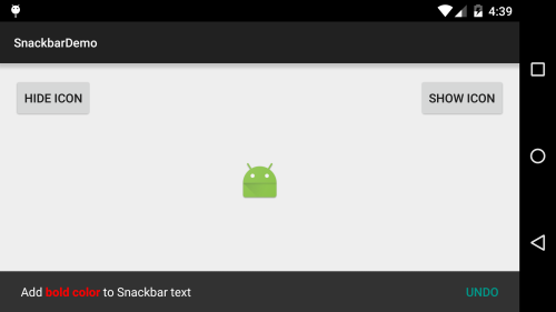
Adding bold text to your Snackbar message
You can add formatting such as bold to your Snackbar text using the Android Html class. The Html.fromHtml() function will generate a Spanned object that can be passed to the Snackbar.make() function:
Snackbar.make(view, Html.fromHtml("Add <b>bold</b> to Snackbar text"), Snackbar.LENGTH_LONG).show();
Adding multi–colored text to your Snackbar message
You are able to add color combinations to the Snackbar text using the SpannableStringBuilder class. Using this class is also an alternative method for applying formatting such as bold to the Snackbar text.
Here is an example:
SpannableStringBuilder snackbarText = new SpannableStringBuilder();
snackbarText.append("Add ");
int boldStart = snackbarText.length();
snackbarText.append("bold color");
snackbarText.setSpan(new ForegroundColorSpan(0xFFFF0000), boldStart, snackbarText.length(), Spannable.SPAN_EXCLUSIVE_EXCLUSIVE);
snackbarText.setSpan(new StyleSpan(android.graphics.Typeface.BOLD), boldStart, snackbarText.length(), Spannable.SPAN_EXCLUSIVE_EXCLUSIVE);
snackbarText.append(" to Snackbar text");

Snackbar.make(view, snackbarText, Snackbar.LENGTH_LONG).show();
Snackbar colored text
Using the Design Support Library with ProGuard
In the initial release of the Design Support Library (22.2.0) you may hit issues with ProGuard. At this stage I would recommend you exclude all the design support library from the effects of ProGuard. This will cause some unnecessary bloat and once an update of the design support library is released you should revisit this issue and look for some official documentation. For now you can add the following to your ProGuard rules:
-dontwarn android.support.design.**
-keep class android.support.design.** { *; }
-keep interface android.support.design.** { *; }
-keep public class android.support.design.R$* { *; }
Bigger is not always better
In the case of a Snackbar minimizing your text length is vital. Be succinct when writing text on the Snackbar, especially the action text. While the text must contain enough information that the user understands the meaning, it can’t be so verbose that layout problems are caused on small devices.
Ensure you test the layout of the text on a range of devices. While your text may look good on your shiny new 10″ tablet, spare a thought for those on the smallest devices your app is targeting.
If it is a possibility that you may localize your app in the future then think about the size of the text now to prevent more work down the track. Consider doing some pseudo-localization testing for your app, remembering that this text could possibly be twice as long after being translated from your apps native language. I have previously blogged about how to test localization using pseudo-localization on Android.
References
Snackbar specification:
http://www.google.com/design/spec/components/snackbars-toasts.html
Snackbar class:
https://developer.android.com/reference/android/support/design/widget/Snackbar.html
CoordinatorLayout class:
http://developer.android.com/reference/android/support/design/widget/CoordinatorLayout.html
 Android By Code
Hi, and thanks for the article. I just want to comment on the width of the CoordinatorLayout. It should be set to match_parent, not wrap_content; this way, on non-tablet devices the Snackbar will cover the screen’s width, as it should.
LikeLike
Good pickup, you are absolutely correct. I am not sure why this was set to wrap_content, as my sample apps used match_parent. I have updated the article to reflect this.
LikeLike
Reblogged this on Dinesh Ram Kali..
LikeLike
Reblogged this on Hakan Kanmaz.
LikeLike
Good explanation. Thanks.
LikeLike